Week 14A: Dashboarding with Panel and the Holoviz Ecosystem
December 6, 2021
Housekeeping
- HW #7 (including final project proposal) — due by the end of the day today
- Feedback via email on project proposals in the next ~week or so
- Last class on Wednesday!
- Extra set of office hours next week, day/time will be announced soon
- Final project due: end of day Monday December 20th
Final project details: https://github.com/MUSA-550-Fall-2021/final-project
Last two classes!
- Interactive dashboards with the Holoviz ecosystem
- Combine all the tools: Altair, Hvplot, Holoviews, GeoViews, Datashader, Folium
- We'll walk through two example dashboards
- Review final project and dashboarding options
Summary: web-based visualizations so far
Github Pages:
- Two options:
- MUSA-550-Fall-2021/github-pages-starter
- MUSA-550-Fall-2021/github-pages-single-page-starter
- Supports: Folium, Altair, Hvplot/Holoviews, HTML files via IFrames
- User cannot use the interactive features of the charts, but cannot change the content dynamically
Today: Panel
- Example gallery: https://panel.pyviz.org/gallery/index.html
- Other demos from a Panel developer: https://jsignell.github.io/
The downside of Github Pages
- Github Pages is static — only user interaction comes from what is built in to the chart
Goal: a Python-based solution with server support where visualizations from different libraries can interact with each other
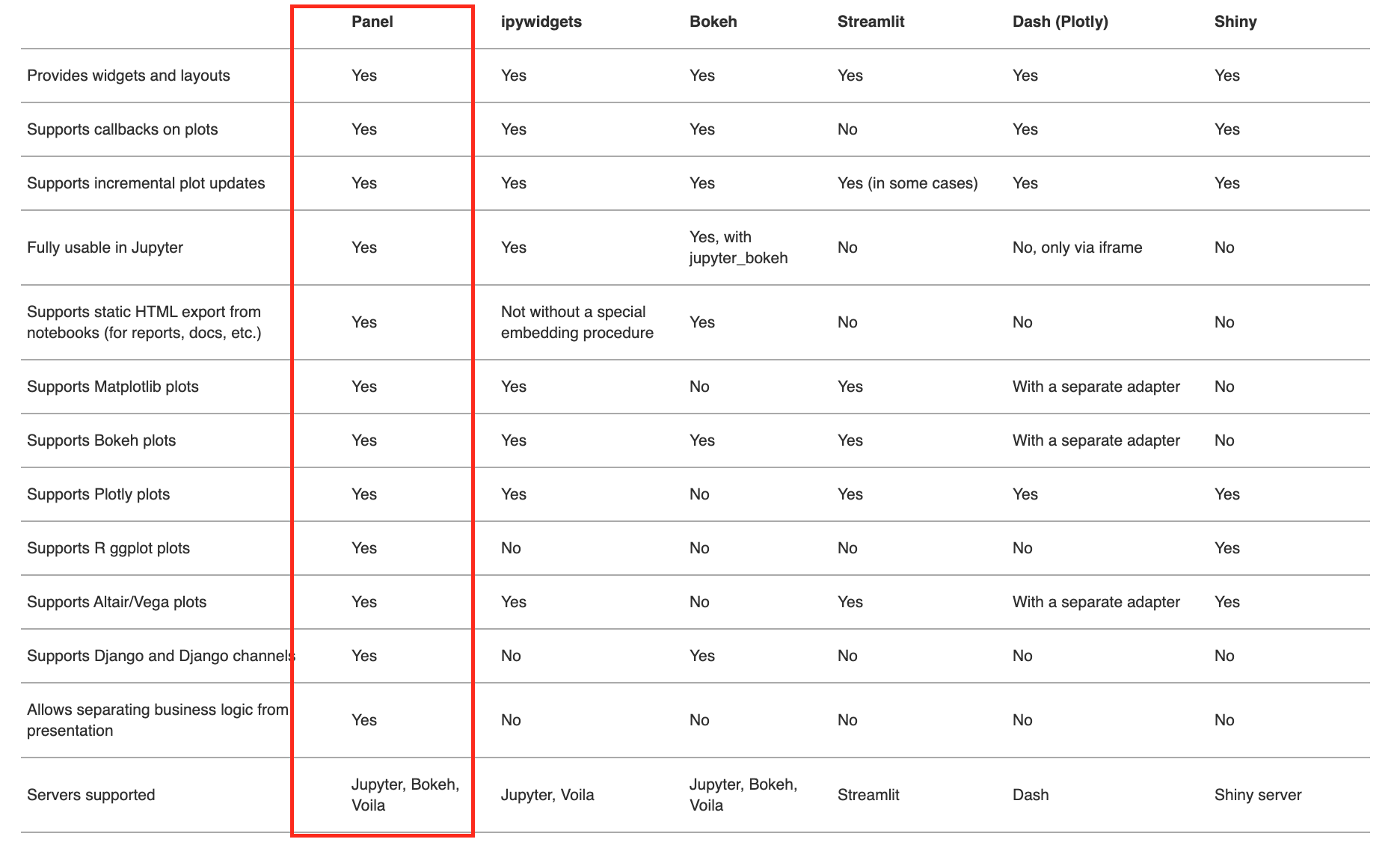
Saving the best for last: Panel
![]()
A high-level dashboarding solution in Python
- Relatively new, but the most promising dashboard library so far
- Supports nearly all plotting libraries
- Works just as well in a Jupyter notebook as on a standalone secure web server
- Large set of interactive widgets`
Very general too...
- Multi-page layouts via tabs: See this page
- Can include custom CSS / Javascript as well
Crucial feature: supports live dashboarding code in a Jupyter notebook and deploying same code to a server
Only library to support entire data wrangling workflow in a Jupyter notebook
See Panel FAQ
Built on top of the HoloViz ecosystem

Also important: Panel provides only support for Datashader and visualizing large datasets
This week's plan
We'll walk through two examples that can serve as reference/templates for the final project:
Dashboard apps in Panel
- Panel contains multiple different APIs to create interactive dashboards.
- Allows you to make a dashboard from a single function, or build up more complex dashboards with many components
The main Panel APIs are:
- Interact functions: Auto-generates a full UI (including widgets) given a function
- Reactive functions: Linking functions or methods to widgets using pn.bind or the equivalent pn.depends decorator, declaring that the function should be re-run when those widget values change
- Parameterized class: Declare parameters and their ranges in Parameterized classes, then get GUIs (and value checking!) for free
Reference: See the API section of the User Guide for a more detailed discussion
Dashboarding Workflow
When using Panel, the general workflow will involve the following steps:
- User changes some parameters via widgets
- The dashboard knows which charts depends on those parameters
- The necessary functions are executed to properly update the dashboard
This is a reactive workflow.
Panel key concepts
- Panes
- A Pane wraps external viewable items like Bokeh, Plotly, Vega/Altair, or HoloViews plots, so they can be embedded in a dashboard. When the wrapped object or any parameter changes, a pane will update the view accordingly.
- See more info on the docs
- Widgets
- A wrapper for the values the user selects, which determines which Panes get updated and which data is shown in the dashboard
- See more info on the docs
- Panels
- Layout objects allow combining plots into a Row, Column, Tabs or a Grid.
- See more info on the docs
Overall, there is layout piece and a reactive parameter/callback piece.
Reference: See the Components section of the User Guide for more info.
Quick API demo: the "cars" dataset
More info available on the docs
import hvplot.pandas
from bokeh.sampledata.autompg import autompg # cars dataset
autompg.head()
# Set up a function to plot using hvplot
def autompg_plot(x='mpg', y='hp', color='#058805'):
    return autompg.hvplot.scatter(x, y, c=color, padding=0.1)

columns = list(autompg.columns[:-2])
columns
The default panel import
# Load panel and enable interactive features
import panel as pn
pn.extension()
1. Interact Functions
The interact function will magically generate a UI (including widgets) automatically by inspecting the arguments of the function given to it.
In the case below, we give the autompg_plot() the allowed options for its 3 arguments x, y, and color, and it auto-generates a Panel dashboard.
# Create a widget to select the color of the scatter points
color = pn.widgets.ColorPicker(name='Color', value='#4f4fdf')

# Auto-generate the layout
layout = pn.interact(autompg_plot, x=columns, y=columns, color=color)

# Create the dashboard with a Row and Column
interact_dashboard = pn.Row(pn.Column('## MPG Explorer', layout[0]), layout[1])
interact_dashboard
2. Reactive Functions
- Very similar to the
interactAPI but is more explicit about widget selection and layout. - You must use the
pn.bindfunction to select and configure widgets explicity and to lay out components explicitly. - The
pn.bind()function explicitly binds the values of the widgets to the arguments of a function.
# Create the widgets
x = pn.widgets.Select(value="mpg", options=columns, name="x")
y = pn.widgets.Select(value="hp", options=columns, name="y")
color = pn.widgets.ColorPicker(name="Color", value="#AA0505")

# Create the dashboard
reactive_dashboard = pn.Row(
    pn.Column("## MPG Explorer", x, y, color), # Title and widgets
    pn.bind(autompg.hvplot.scatter, x, y, c=color), # Main chart
)

reactive_dashboard
3. Parametrized Classes
You are welcome to use any of the APIs to create dashboards for the final project. However, this is the recommended approach (although I recognize it's a bit more complex than options #1 and #2).
We'll define our app in a declarative fashion using a custom Python class that defines the various components of our dashboard, which include:
- The parameters we want the user to be able to change.
- Reactive functions to generate the various charts/maps in our dashboard, based on those input parameters.
- The dependencies between our chart functions and parameters.
Note: The example apps on our course Github page use the class API to define the dashboard.
First some quick background: an introduction to Python classes
Let's take a quick look at this nice tutorial
The Param library
- Widgets in Panel depend on the
Paramlibrary - These widgets allow you to declare the parameters of a dashboard in a declarative manner.
- Declare the type of parameter you need and get the corresponding widget in your dashboard for free!
- Many many examples: https://panel.holoviz.org/user_guide/Param.html
import param
# Define the class
class MPGExplorer(param.Parameterized):
    """A Panel dashboard class."""

    x = param.Selector(objects=columns)
    y = param.Selector(default='hp', objects=columns)
    color = param.Color(default='#0f0f0f')

    @param.depends('x', 'y', 'color') # This is a Python "decorator"!
    def make_autompg_plot(self):
        return autompg_plot(self.x, self.y, self.color)
# Initialize the dashboard class object
explorer = MPGExplorer()

# Create the dashboard layout
# Note: widgets are stored in the 'param' attribute by default
class_dashboard = pn.Row(explorer.param, explorer.make_autompg_plot)

class_dashboard
Great examples on their documentation
I'd encourage you to spend some time reading through their documentation...
- Documentation homepage
- User Guide
- An overview of the concepts powering Panel dashboards
- App Gallery
- Examples of end-to-end apps using Panel
- Reference Gallery
- Examples (code snippets) for the many different kinds of components possible in Panel dashboards
- Awesome Panel
- Github repository of resources and information on Panel
- Awesome Panel gallery of example apps
Note: Dashboard Templates
Panel has recently added default layout templates to provide a simple, well-designed layout for the dashboard. They are all very similar and break the layout into various pieces, including the:
- Title
- Sidebar
- Main content
Examples:
See more: https://panel.holoviz.org/user_guide/Templates.html
Two example repositories on the course's Github
Example 1: Philadelphia shootings
- Tools: Panel, Hvplot/Holoviews, Altair, Folium
- This includes two separate apps:
app1.ipynbandapp2.ipynb
https://github.com/MUSA-550-Fall-2021/philadelphia-shootings-app
Example 2: NYC Taxi Trips
- Tools: Panel, Hvplot/Holoviews, Altair, Datashader
- This includes a single app:
app.ipynb
https://github.com/MUSA-550-Fall-2021/datashader-nyc-taxi-app