from matplotlib import pyplot as plt
import numpy as np
import pandas as pd
import geopandas as gpd
np.random.seed(42)
Lecture 13A: From Notebooks to the Web: Github Pages
Dec 1, 2021
Housekeeping
- Assigment #7 (including final project proposal) due on Monday 12/6
- There will be additional office hours the week of Dec 13th (the week after classes end)
Final project due: end of day on Monday, December 20th
Outline for the rest of the course
We'll discuss ways to translate our analysis results to the Web in a meaningful way. We'll cover two methods to do so, each with their own pros and cons:
- Embedding interactive charts on the Web via Github Pages
- Creating Web apps & dashboards using the Python library Panel
Today: we'll focus on the first today and cover Panel in detail next week
Part 1: Embedding Interactive Charts on the Web
To start, let's recap three ways that we've learned to produce interactive charts in the course:
- Altair
- Hvplot
- Folium
Example 1: Measles Incidence in Altair
Load the data from week 2:
url = "https://raw.githubusercontent.com/MUSA-550-Fall-2021/week-2/master/data/measles_incidence.csv"
data = pd.read_csv(url, skiprows=2, na_values="-")
data.head()
Use the pandas.melt() function to convert it to tidy format:
annual = data.drop('WEEK', axis=1)
measles = annual.groupby('YEAR').sum().reset_index()
measles = measles.melt(id_vars='YEAR', var_name='state', value_name='incidence')
measles.head()
Now let's load altair:
import altair as alt
# use a custom color map
colormap = alt.Scale(
    domain=[0, 100, 200, 300, 1000, 3000],
    range=[
        "#F0F8FF",
        "cornflowerblue",
        "mediumseagreen",
        "#FFEE00",
        "darkorange",
        "firebrick",
    ],
    type="sqrt",
)

# Vertical line for vaccination year
threshold = pd.DataFrame([{"threshold": 1963}])

# plot YEAR vs state, colored by incidence
chart = (
    alt.Chart(measles)
    .mark_rect()
    .encode(
        x=alt.X("YEAR:O", axis=alt.Axis(title=None, ticks=False)),
        y=alt.Y("state:N", axis=alt.Axis(title=None, ticks=False)),
        color=alt.Color("incidence:Q", sort="ascending", scale=colormap, legend=None),
        tooltip=["state", "YEAR", "incidence"],
    )
    .properties(width=650, height=500)
)

rule = alt.Chart(threshold).mark_rule(strokeWidth=4).encode(x="threshold:O")

out = chart + rule
out
Saving Altair Plots
Altair plots can be fully represented as JSON data. This makes them very easy to embed on websites, as we shall soon see!
# save the chart as JSON
out.save("measlesAltair.json")
# save the chart as HTML
out.save("measlesAltair.html")
Now, let's compare the HTML and JSON files...
Measles Incidence in hvplot
import hvplot.pandas
import hvplot
# Make the heatmap with hvplot
heatmap = measles.hvplot.heatmap(
    x="YEAR",
    y="state",
    C="incidence", # color each square by the incidence
    reduce_function=np.sum, # sum the incidence for each state/year
    frame_height=450,
    frame_width=600,
    flip_yaxis=True,
    rot=90,
    colorbar=False,
    cmap="viridis",
    xlabel="",
    ylabel="",
)

# Some additional formatting using holoviews
# For more info: http://holoviews.org/user_guide/Customizing_Plots.html
heatmap = heatmap.redim(state="State", YEAR="Year")
heatmap = heatmap.opts(fontsize={"xticks": 0, "yticks": 6}, toolbar="above")
heatmap
type(heatmap)
Saving Hvplot Plots
HTML is are only option here...
import hvplot
hvplot.save(heatmap, 'measlesHvplot.html')
Example 3: Folium + OSMnx
- This is a recap of the material we covered in Week 9.
- We'll quickly walk through how we used osmnx to created an interactive Folium map of the shortest route between two points.
import osmnx as ox
Identify the lat/lng coordinates for our places of interest: Use osmnx to download the geometries for the Libery Bell and Art Museum
philly_tourism = ox.geometries_from_place("Philadelphia, PA", tags={"tourism": True})
art_museum = philly_tourism.query("name == 'Philadelphia Museum of Art'").squeeze()

art_museum.geometry
liberty_bell = philly_tourism.query("name == 'Liberty Bell'").squeeze()

liberty_bell.geometry
Get the street graph in Center City: Use osmnx to download the street network around City Hall.
G = ox.graph_from_address('City Hall, Philadelphia, USA',
                          dist=1500,
                          network_type='drive')
Identify the nodes in the graph closest to our points of interest.
# Get the origin node
orig_node = ox.distance.nearest_nodes(G, liberty_bell.geometry.x, liberty_bell.geometry.y)

# Get the destination node
dest_node = ox.distance.nearest_nodes(G, art_museum.geometry.centroid.x, art_museum.geometry.centroid.y)
Use networkx to find the shortest path
import networkx as nx
# Calculate the shortest path between these nodes
route = nx.shortest_path(G, orig_node, dest_node)
# The underlying graph of streets
graph_map = ox.plot_graph_folium(G, popup_attribute='name', edge_width=2)

# Plot the route with folium on top of the previously created graph_map
route_graph_map = ox.plot_route_folium(G, route, route_map=graph_map)
Saving Folium Maps
Just use the save() function!
route_graph_map.save("foliumChart.html")
from IPython.display import IFrame

# Display the HTML file in the notebook
IFrame("foliumChart.html", width=600, height=500)
How can we display these charts on the Web?
We can embed them on GitHub Pages...
Part 2: Github Pages
- We can embed these interactive charts on static (no server) websites such as Github Pages
- Github Pages is static website that can be automatically generated from any Github repository
Template Sites with Examples
I've created two template repositories that you can use to quickly get up and running with Github Pages
Option #1:
- Repository: https://github.com/MUSA-550-Fall-2021/github-pages-starter
- Rendered site: https://musa-550-fall-2021.github.io/github-pages-starter
Option #2:
Github Pages URL
The structure of the URL for the rendered page is:
https://[USERNAME].github.io/[REPOSITORY NAME]
Note: you can create a new website for every repository, so this will work even if you have a personal Github Pages website set up.
Step 1: Create your own repository
- Start from the main repository, either https://github.com/MUSA-550-Fall-2021/github-pages-starter or https://github.com/MUSA-550-Fall-2021/github-pages-single-page-starter
- This repository is a template repository
- Click on the "Use this template" button to create your own version of the repository
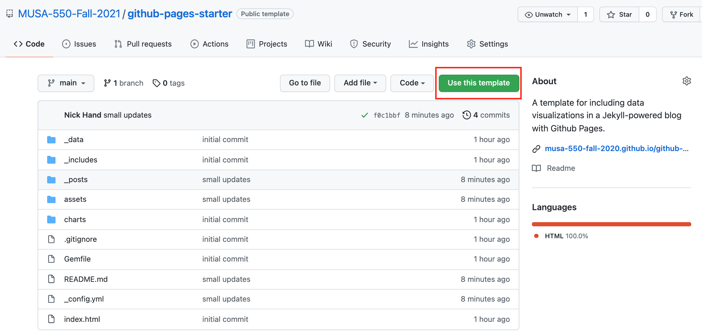
For more information, see this guide on creating a repository from a template.
Step 2: Choose a name and description
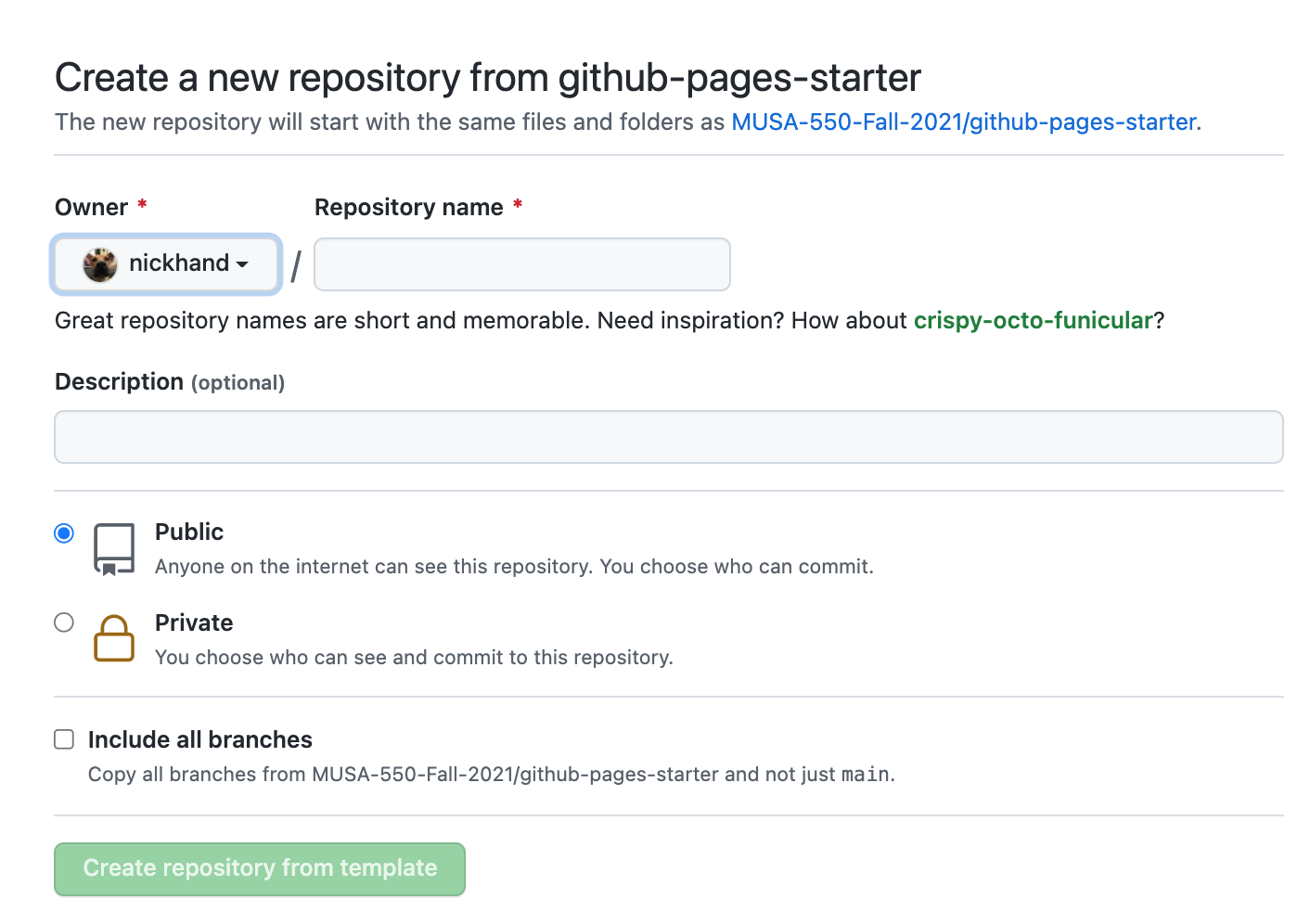
Step 3: Enable Github Pages on your new repository
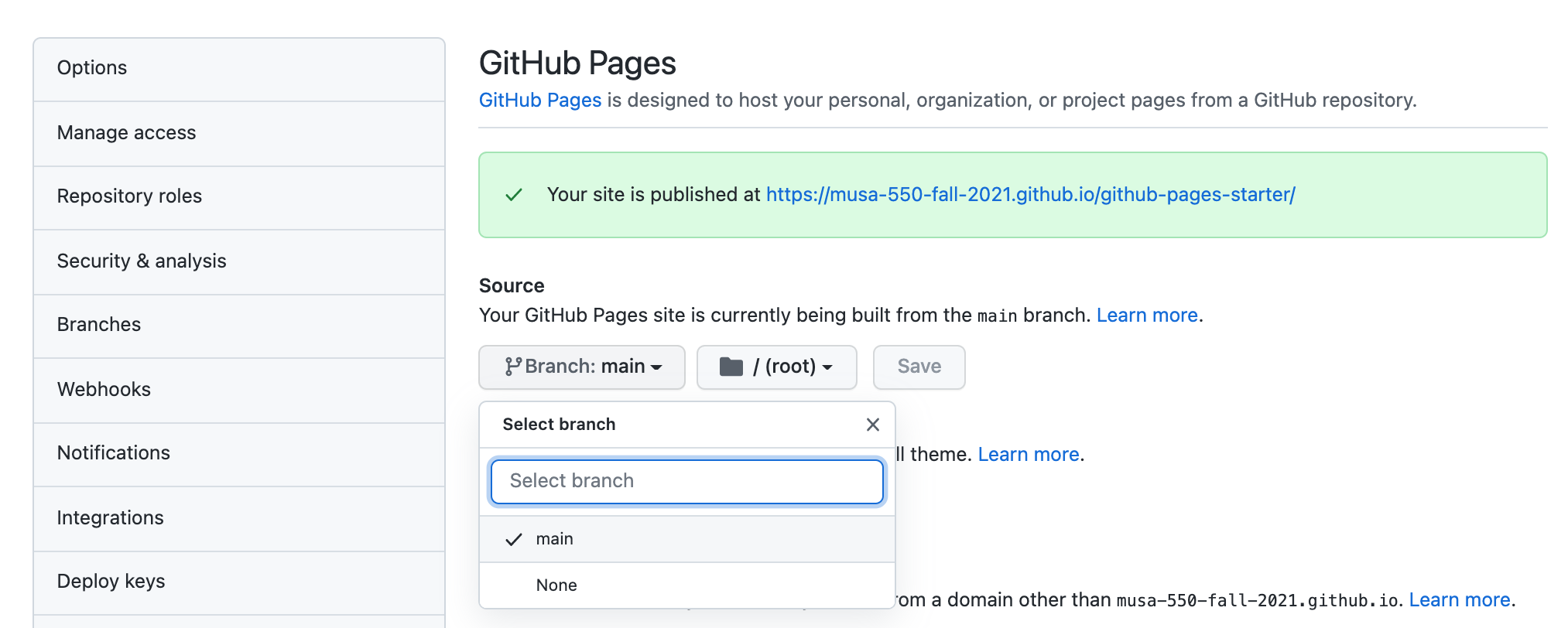
On the home page for your new repository go to "Settings":
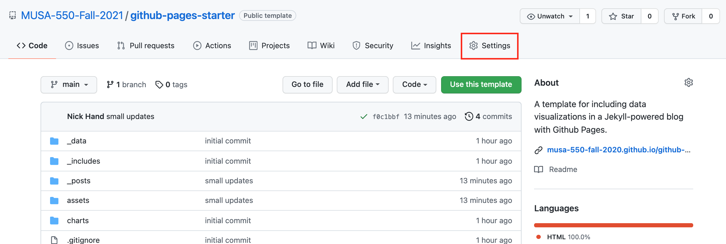
- Scroll down, and under the "Github Pages" section, select the "main" as the branch to be used for GitHub pages.
- This will automatically build the website at the following URL:
https://[USERNAME].github.io/[REPOSITORY NAME]
Step 4: Customize your site
- Enter your site name, description, etc by editing the
_config.ymlfile. - There are two different ways that you can make changes to your blog's files:
- Edit files within your in the browser at GitHub.com
- Clone down your repository and make updates locally, then push them to your GitHub repository.
Step 5: Publish a post
Option #1: Multiple page
- Posts are written in Markdown and any files added to the
_postsdirectory will be automatically uploaded and published - Useful resource: Markdown Cheatsheet
Option #2: Single page
- Edit the
index.mdfile and add the relevant content to this single file and it will be rendered on the main website page.
Option #1: Adding new posts
To add new posts, simply add a file in the _posts directory that:
- follows the convention
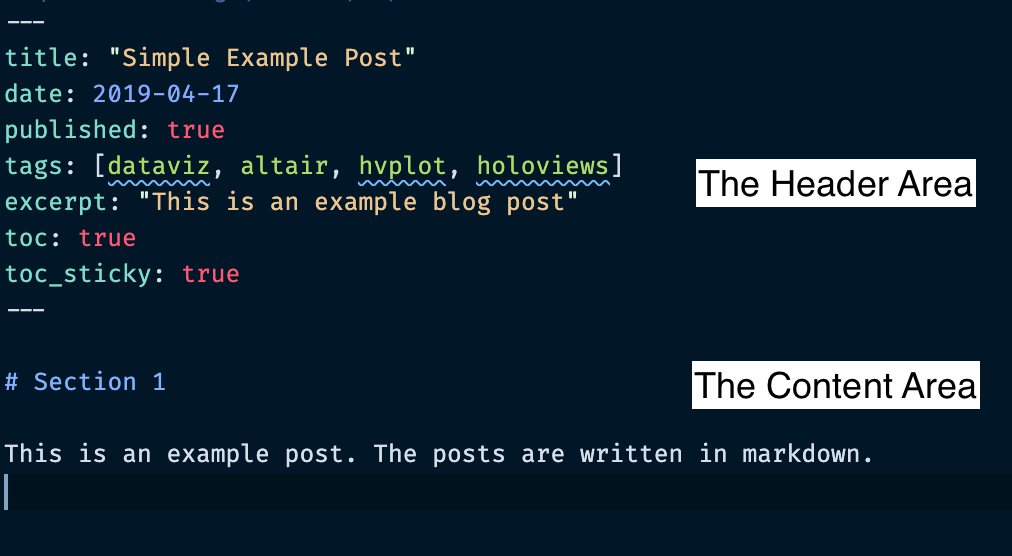
YYYY-MM-DD-name-of-post.ext - Includes the necessary header material (see the next slide)
You can take a look at the source for the existing posts in the _posts folder to get an idea about how it works.
How can we embed our (static) Matplotlib charts?
These are just normal PNG images — we can use Markdown's syntax for embedding images.

Embedding images: the syntax

Header syntax
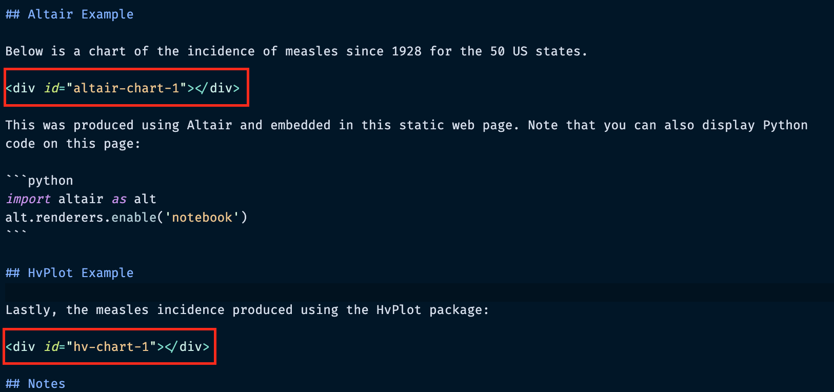
Under the altair-loader and hv-loader we need to specify two things:
- The CSS "id" attribute for the div where we want the chart to go
- The path to the HTML or JSON file to load (must be in the charts/ folder)
This should be specified as key: value pairs, for example:
altair-chart-1: "charts/measlesAltair.json"
In this case altair-chart-1 is the CSS identifier and "charts/measlesAltair.json" is the name of the file to load.
Note: there must be a matching "div" element with the same CSS identifier — this is where the chart will be embedded!
Important
- For altair charts, you should point the loader the saved JSON representation of the chart
- For hvplot charts, you should point the loader to the saved HTML representation of the chart
Embedding Altair/Hvplot charts: the content
Embedding Folium charts: example
Rendered: https://musa-550-fall-2021.github.io/github-pages-starter/folium-charts/
Embedding Folium charts: the header
Header syntax
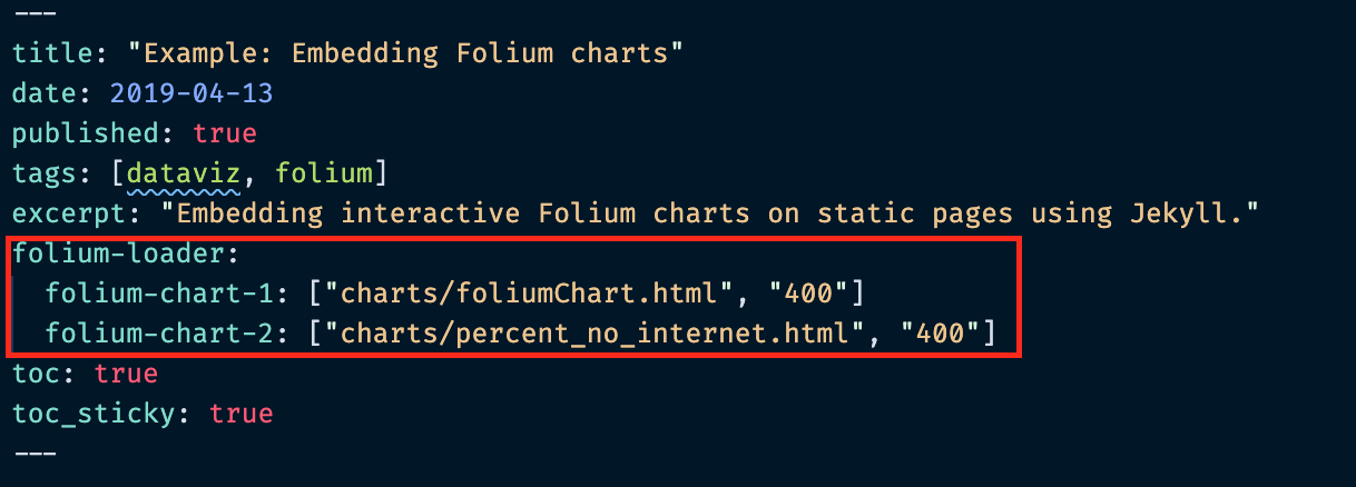
For the folium-loader, the syntax is:
CSS identifier for chart : ["chart file path", "width of chart in pixels"]
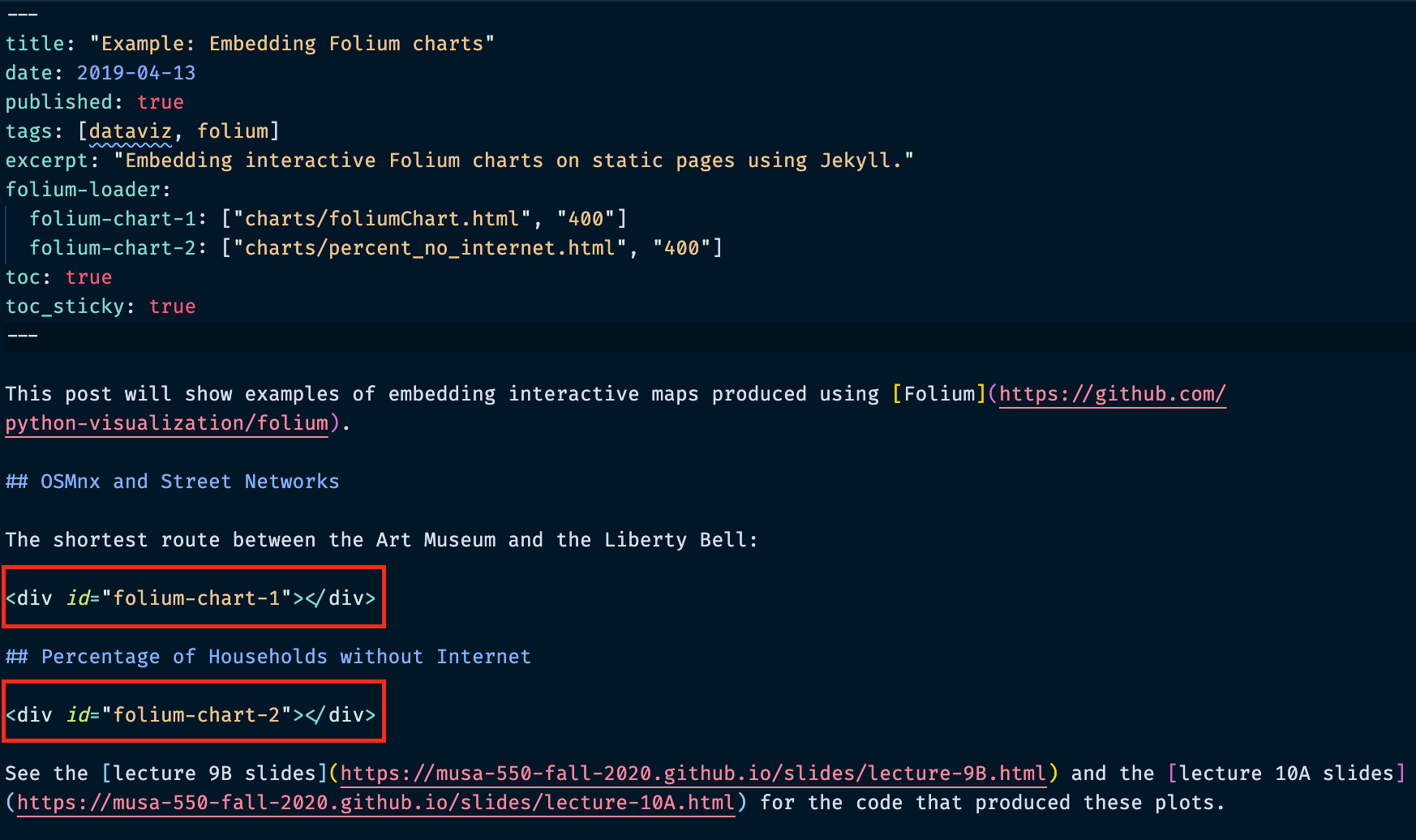
Again, there must be a matching "div" element with the same CSS identifier — this is where the chart will be embedded!
Embedding Folium charts: the content
So, which files are important?
There's a lot of extra stuff we don't actually need. The most important files/folders are:
_config.yml: the main configuration file for the site, where you can change names, titles, etc_posts/: where the markdown posts (your content!) goassets/images/: where you can place your static matplotlib-generated PNG filescharts/: where you can place your.htmlor.jsonfiles from Altair/Hvplot/Folium
Exercise: Setup your own Github Pages project page
Steps:
- Follow the above instructions to set up your own project website
- Create an interactive Altair chart for the Gapminder health/income dataset
- Create a new post by adding a new post (with the proper file name convention) to the
_postsfolder - Embed the Altair chart in your new post
Notes
- As a reminder, the gapminder dataset is available from the built-in
vega_datasetspackage - We want to plot a scatter chart with the income on the x-axis and the life expectancy on the y-axis
import altair as alt
from vega_datasets import data

source = data.gapminder_health_income.url
source
Remember: we can save altair charts as JSON files and use the altair-loader to directly load the JSON representation.
