from matplotlib import pyplot as plt
import numpy as np
import pandas as pd
import geopandas as gpd
np.random.seed(42)
plt.rcParams['figure.figsize'] = (10,6)
Week 10: Clustering Analysis in Python
Nov 8, 2021
Housekeeping
- Assignment #5 (optional) due on Wednesday (11/10)
- Assignment #6 (optional) will be assigned on Wednesday, due in 2 weeks (11/24)
- Remember, you have to do one of homeworks #4, #5, or #6
Recap
- Last week: urban street networks + interactive web maps
- New tools: OSMnx, Pandana, and Folium
Where we left off last week: choropleth maps in Folium
Example: A map of households without internet for US counties
Two ways:
- The easy way:
folium.Choropleth - The hard way:
folium.GeoJson
import folium
Load the data, remove counties with no households and add our new column:
# Load CSV data from the data/ folder
census_data = pd.read_csv("./data/internet_avail_census.csv", dtype={"geoid": str})

# Remove counties with no households
valid = census_data['universe'] > 0
census_data = census_data.loc[valid]

# Calculate the percent without internet
census_data['percent_no_internet'] = census_data['no_internet'] / census_data['universe']
census_data.head()
Load the counties geometry data too:
# Load counties GeoJSOn from the data/ folder
counties = gpd.read_file("./data/us-counties-10m.geojson")
counties.head()
The hard way: use folium.GeoJson
- The good:
- More customizable, and can add user interaction
- The bad:
- Requires more work
- No way to add a legend, see this open issue on GitHub
The steps involved
- Join data and geometry features into a single GeoDataFrame
- Define a function to style features based on data values
- Create GeoJSON layer and add it to the map
Step 1: Join the census data and features
Note: this is different than using folium.Choropleth, where data and features are stored in two separate data frames.
# Merge the county geometries with census data
# Left column: "id"
# Right column: "geoid"
census_joined = counties.merge(census_data, left_on="id", right_on="geoid")
census_joined.head()
Step 2: Normalize the data column to 0 to 1
- We will use a matplotlib color map that requires data to be between 0 and 1
- Normalize our "percent_no_internet" column to be between 0 and 1
# Minimum
min_val = census_joined['percent_no_internet'].min()

# Maximum
max_val = census_joined['percent_no_internet'].max()

# Calculate a normalized column
normalized = (census_joined['percent_no_internet'] - min_val) / (max_val - min_val)

# Add to the dataframe
census_joined['percent_no_internet_normalized'] = normalized
Step 3: Define our style functions
- Create a matplotlib colormap object using
plt.get_cmap() - Color map objects are functions: give the function a number between 0 and 1 and it will return a corresponding color from the color map
- Based on the feature data, evaluate the color map and convert to a hex string
import matplotlib.colors as mcolors
# Use a red-purple colorbrewer color scheme
cmap = plt.get_cmap('RdPu')
# The minimum value of the color map as an RGB tuple
cmap(0)
# The minimum value of the color map as a hex string
mcolors.rgb2hex(cmap(0.0))
# The maximum value of the color map as a hex string
mcolors.rgb2hex(cmap(1.0))
def get_style(feature):
    """
    Given an input GeoJSON feature, return a style dict.

    Notes
    -----
    The color in the style dict is determined by the
    "percent_no_internet_normalized" column in the
    input "feature".
    """
    # Get the data value from the feature
    value = feature['properties']['percent_no_internet_normalized']

    # Evaluate the color map
    # NOTE: value must between 0 and 1
    rgb_color = cmap(value) # this is an RGB tuple

    # Convert to hex string
    color = mcolors.rgb2hex(rgb_color)

    # Return the style dictionary
    return {'weight': 0.5, 'color': color, 'fillColor': color, "fillOpacity": 0.75}
def get_highlighted_style(feature):
    """
    Return a style dict to use when the user highlights a
    feature with the mouse.
    """

    return {"weight": 3, "color": "black"}
Step 4: Convert our data to GeoJSON
- Tip: To limit the amount of data Folium has to process, it's best to trim our GeoDataFrame to only the columns we'll need before converting to GeoJSON
- You can use the
.to_json()function to convert to a GeoJSON string
needed_cols = ['NAME', 'percent_no_internet', 'percent_no_internet_normalized', 'geometry']
census_json = census_joined[needed_cols].to_json()
# STEP 1: Initialize the map
m = folium.Map(location=[40, -98], zoom_start=4)

# STEP 2: Add the GeoJson to the map
folium.GeoJson(
    census_json, # The geometry + data columns in GeoJSON format
    style_function=get_style, # The style function to color counties differently
    highlight_function=get_highlighted_style,
    tooltip=folium.GeoJsonTooltip(['NAME', 'percent_no_internet'])
).add_to(m)


# avoid a rendering bug by saving as HTML and re-loading
m.save('percent_no_internet.html')
And viola!
The hard way is harder, but we have a tooltip and highlight interactivity!
from IPython.display import IFrame
IFrame('percent_no_internet.html', width=800, height=500)
At-home exercise: Can we repeat this with altair?
Try to replicate the above interactive map exactly (minus the background tiles). This includes:
- Using the red-purple colorbrewer scheme
- Having a tooltip with the percentage and county name
Note: Altair's syntax is similar to the folium.Choropleth syntax — you should pass the counties GeoDataFrame to the alt.Chart() and then use the transform_lookup() to merge those geometries to the census data and pull in the census data column we need ("percent_without_internet").
Hints
- The altair example gallery includes a good choropleth example: https://altair-viz.github.io/gallery/choropleth.html
- See altair documentation on changing the color scheme and the Vega documentation for the names of the allowed color schemes in altair
- You'll want to specify the projection type as "albersUsa"
import altair as alt
# Initialize the chart with the counties data
alt.Chart(counties).mark_geoshape(stroke="white", strokeWidth=0.25).encode(
    # Encode the color
    color=alt.Color(
        "percent_no_internet:Q",
        title="Percent Without Internet",
        scale=alt.Scale(scheme="redpurple"),
        legend=alt.Legend(format=".0%")
    ),
    # Tooltip
    tooltip=[
        alt.Tooltip("NAME:N", title="Name"),
        alt.Tooltip("percent_no_internet:Q", title="Percent Without Internet", format=".1%"),
    ],
).transform_lookup(
    lookup="id", # The column name in the counties data to match on
    from_=alt.LookupData(census_data, "geoid", ["percent_no_internet", "NAME"]), # Match census data on "geoid"
).project(
    type="albersUsa"
).properties(
    width=700, height=500
)
Leaflet/Folium plugins
One of leaflet's strengths: a rich set of open-source plugins
https://leafletjs.com/plugins.html
Many of these are available in Folium!
Example: Heatmap
from folium.plugins import HeatMap
HeatMap?
Example: A heatmap of new construction permits in Philadelphia in the last 30 days
New construction in Philadelphia requires a building permit, which we can pull from Open Data Philly.
- Data available from OpenDataPhilly: https://www.opendataphilly.org/dataset/licenses-and-inspections-building-permits
- Query the database API directly to get the GeoJSON
- We can use the
carto2gpdpackage to get the data - API documentation: https://cityofphiladelphia.github.io/carto-api-explorer/#permits
Step 1: Download the data from CARTO
The "current_date" variable in SQL databases
You can use the pre-defined "current_date" variable to get the current date. For example, to get the permits from the past 30 days, we could do:
SELECT * FROM permits WHERE permitissuedate >= current_date - 30
Selecting only new construction permits
To select new construction permits, you can use the "permitdescription" field. There are two relevant categories:
- "RESIDENTIAL BUILDING PERMIT"
- "COMMERCIAL BUILDING PERMIT"
We can use the SQL IN command (documentation) to easily select rows that have these categories.
import carto2gpd
# API URL
url = "https://phl.carto.com/api/v2/sql"

# Table name on CARTO
table_name = "permits"

# The where clause, with two parts
DAYS = 30
where = f"permitissuedate >= current_date - {DAYS}"
where += " and permitdescription IN ('RESIDENTIAL BUILDING PERMIT', 'COMMERCIAL BUILDING PERMIT')"

where
# Run the query
permits = carto2gpd.get(url, table_name, where=where)
len(permits)
permits.head()
Step 2: Remove missing geometries
Some permits don't have locations — use the .geometry.notnull() function to trim the data frame to those incidents with valid geometries.
permits = permits.loc[permits.geometry.notnull()].copy()
Step 3: Extract out the lat/lng coordinates
Note: We need an array of (latitude, longitude) pairs. Be careful about the order!
# Extract the lat and longitude from the geometery column
permits['lat'] = permits.geometry.y
permits['lng'] = permits.geometry.x
permits.head()
# Split out the residential and commercial
residential = permits.query("permitdescription == 'RESIDENTIAL BUILDING PERMIT'")
commercial = permits.query("permitdescription == 'COMMERCIAL BUILDING PERMIT'")
# Make a NumPy array (use the "values" attribute)
residential_coords = residential[['lat', 'lng']].values
commercial_coords = commercial[['lat', 'lng']].values
commercial_coords[:5]
Step 4: Make a Folium map and add a HeatMap
The HeatMap takes the list of coordinates: the first column is latitude and the second column longitude
Commercial building permits
# Initialize map
m = folium.Map(
    location=[39.99, -75.13],
    tiles='Cartodb Positron',
    zoom_start=12
)


# Add heat map coordinates
HeatMap(commercial_coords, radius=15).add_to(m)

m
Residential building permits
HeatMap?
# Initialize map
m = folium.Map(
    location=[39.99, -75.13],
    tiles='Cartodb Positron',
    zoom_start=12
)


# Add heat map
HeatMap(residential_coords, radius=15).add_to(m)

m
Takeaways
Commercial construction concentrated in the greater Center City area while residential construction is primarily outside of Center City...
That's it for interactive maps w/ Folium...
Now on to clustering...
Clustering in Python
- Both spatial and non-spatial datasets
- Two new techniques:
- Non-spatial: K-means
- Spatial: DBSCAN
- Two labs/exercises this week:
- Grouping Philadelphia neighborhoods by AirBnb listings
- Identifying clusters in taxi rides in NYC
"Machine learning"

- The computer learns patterns and properties of an input data set without the user specifying them beforehand
- Can be both supervised and unsupervised
Machine learning in Python: scikit-learn
- State-of-the-art machine learning in Python
- Easy to use, lots of functionality
Clustering is just one (of many) features

https://scikit-learn.org/stable/
Note: We will focus on clustering algorithms today and discuss a few other machine learning techniques in the next two weeks. If there is a specific scikit-learn use case we won't cover, I'm open to ideas for incorporating it as part of the final project.
Part 1: Non-spatial clustering
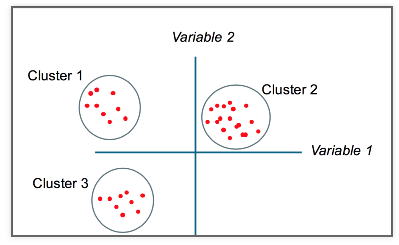
The goal
Partition a dataset into groups that have a similar set of attributes, or features, within the group and a dissimilar set of features between groups.
Minimize the intra-cluster variance and maximize the inter-cluster variance of features.
Some intuition

K-Means clustering
- Simple but robust clustering algorithm
- Widely used
- Important: user must specify the number of clusters
- Cannot be used to find density-based clusters
This is just one of several clustering methods
https://scikit-learn.org/stable/modules/clustering.html#overview-of-clustering-methods
A good introduction
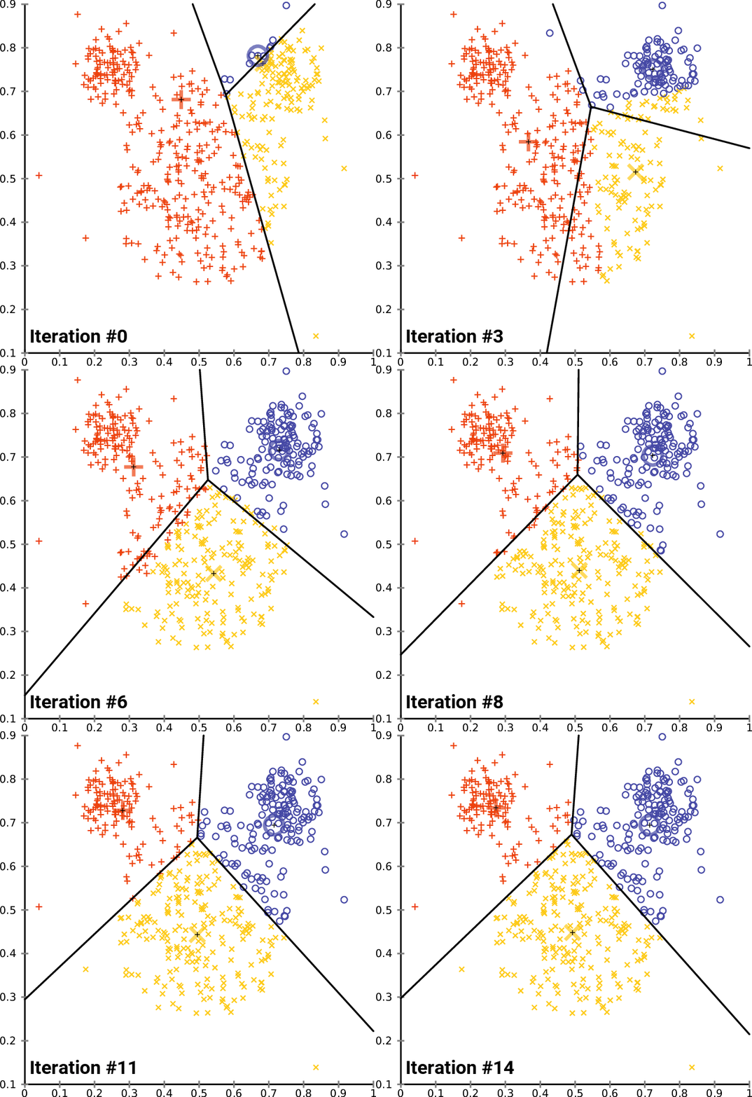
How does it work?
Minimizes the intra-cluster variance: minimizes the sum of the squared distances between all points in a cluster and the cluster centroid
K-means in action

import altair as alt
from vega_datasets import data as vega_data
Read the data from a URL:
gapminder = pd.read_csv(vega_data.gapminder_health_income.url)
gapminder.head()
Plot it with altair
alt.Chart(gapminder).mark_circle().encode(
    alt.X("income:Q", scale=alt.Scale(type="log")),
    alt.Y("health:Q", scale=alt.Scale(zero=False)),
    size='population:Q',
    tooltip=list(gapminder.columns),
).interactive()
K-Means with scikit-learn
from sklearn.cluster import KMeans
Let's start with 5 clusters
KMeans?
kmeans = KMeans(n_clusters=5)
Lot's of optional parameters, but n_clusters is the most important:
kmeans
Let's fit just income first
Use the fit() function
kmeans.fit(gapminder[['income']])
Extract the cluster labels
Use the labels_ attribute
gapminder['label'] = kmeans.labels_
How big are our clusters?
gapminder.groupby('label').size()
Plot it again, coloring by our labels
alt.Chart(gapminder).mark_circle().encode(
    alt.X('income:Q', scale=alt.Scale(type='log')),
    alt.Y('health:Q', scale=alt.Scale(zero=False)),
    size='population:Q',
    color=alt.Color('label:N', scale=alt.Scale(scheme='dark2')),
    tooltip=list(gapminder.columns)
).interactive()
Calculate average income by group
gapminder.groupby("label")['income'].mean().sort_values()
Data is nicely partitioned into income levels
How about health, income, and population?
# Fit all three columns
kmeans.fit(gapminder[['income', 'health', 'population']])

# Extract the labels
gapminder['label'] = kmeans.labels_
Plot the new labels
alt.Chart(gapminder).mark_circle().encode(
    alt.X('income:Q', scale=alt.Scale(type='log')),
    alt.Y('health:Q', scale=alt.Scale(zero=False)),
    size='population:Q',
    color=alt.Color('label:N', scale=alt.Scale(scheme='dark2')),
    tooltip=list(gapminder.columns)
).interactive()
It....didn't work that well
What's wrong?
K-means is distance-based, but our features have wildly different distance scales
scikit-learn to the rescue: pre-processing
- Scikit-learn has a utility to normalize features with an average of zero and a variance of 1
- Use the
StandardScalerclass
from sklearn.preprocessing import MinMaxScaler
from sklearn.preprocessing import StandardScaler
scaler = StandardScaler()
Use the fit_transform() function to scale your features
gapminder_scaled = scaler.fit_transform(gapminder[['income', 'health', 'population']])
Important: The fit_transform() function converts the DataFrame to a numpy array:
# fit_transform() converts the data into a numpy array
gapminder_scaled[:5]
# mean of zero
gapminder_scaled.mean(axis=0)
# variance of one
gapminder_scaled.std(axis=0)
Now fit the scaled features
# Perform the fit
kmeans.fit(gapminder_scaled)

# Extract the labels
gapminder['label'] = kmeans.labels_
alt.Chart(gapminder).mark_circle().encode(
    alt.X('income:Q', scale=alt.Scale(type='log')),
    alt.Y('health:Q', scale=alt.Scale(zero=False)),
    size='population:Q',
    color=alt.Color('label:N', scale=alt.Scale(scheme='dark2')),
    tooltip=list(gapminder.columns)
).interactive()
# Number of countries per cluster
gapminder.groupby("label").size()
# Average population per cluster
gapminder.groupby("label")['population'].mean().sort_values() / 1e6
# Average life expectancy per cluster
gapminder.groupby("label")['health'].mean().sort_values()
# Average income per cluster
gapminder.groupby("label")['income'].mean().sort_values() / 1e3
gapminder.loc[gapminder['label']==4]
kmeans.inertia_
gapminder.loc[gapminder['label']==2]
Exercise: Clustering neighborhoods by Airbnb stats
I've extracted neighborhood Airbnb statistics for Philadelphia neighborhoods from Tom Slee's website.
The data includes average price per person, overall satisfaction, and number of listings.
Two good references for Airbnb data
Original research study: How Airbnb's Data Hid the Facts in New York City
To be continued!